Style Typography

Typography

Style Expand and collapse content An arrow that points down when collapsed and points up when expanded.

The following font styles and sizes are commonly used in the TV UI.

Content title:
Light 34sp

Content title:
Light 24sp

Browse lane title:
Condensed 20sp

Subhead Regular:
16sp

Button Label Condensed:
16sp

Body Regular:
14sp

List item/card primary text:
Condensed Regular 14sp

Secondary text:
Condensed Regular: 12sp

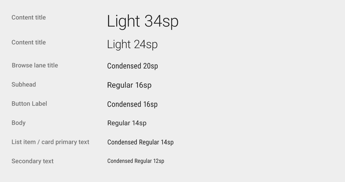
Rendering of TV font styles and sizes

Dynamic font size Expand and collapse content An arrow that points down when collapsed and points up when expanded.

Text length for content titles can vary from short to long. Consider using dynamic type to vary text size based on available space and letter size estimates.

Example font pairing

Title: 34sp, Leading 40sp
Body: 14sp, Leading 24sp

Example font pairing

Title: 24sp, Leading 32sp
Body: 14sp, Leading 24sp

Condensed fonts Expand and collapse content An arrow that points down when collapsed and points up when expanded.

For English and English-like scripts, use condensed fonts to efficiently accommodate text in limited spaces.

Padding for the footer content: 12dp
Title: 14sp Condensed Regular
Body: 12sp, Condensed Regular

Padding for the main content: 16dp
Padding for the footer content: 12dp