System overview Navigation

Navigation

Navigating Android TV should be easy. Designing apps for Android TV requires rethinking user input methods, as users navigate an app using a remote controller instead of a touchscreen.

Controllers Expand and collapse content An arrow that points down when collapsed and points up when expanded.

Android TV controllers can vary, many controllers include the directional pad (D-pad), select, play/pause home, back and microphone buttons.

Directional pad

The primary navigation method on Android TV is through the directional pad (called a D-pad). This pad limits movement to up, down, left, and right directional hardware buttons. The D-pad transfers focus from one object to the nearest object in the direction of the button pressed.

D-Pad navigation is less intuitive than a touch screen, so testing is important to providing a good user experience:

  • Can users easily navigate to all objects in each screen?
  • Is movement between objects straightforward and predictable?
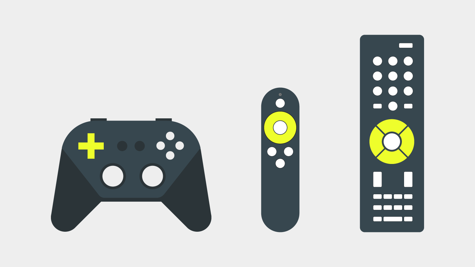
Supported controllers with various directional pads
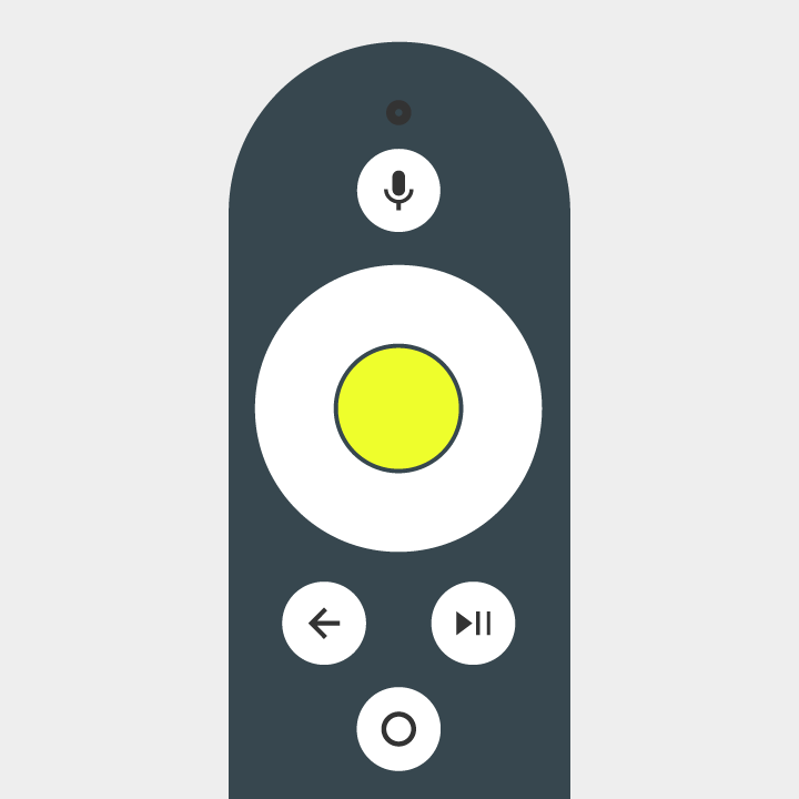
Select button

The select button selects an item focused on-screen.
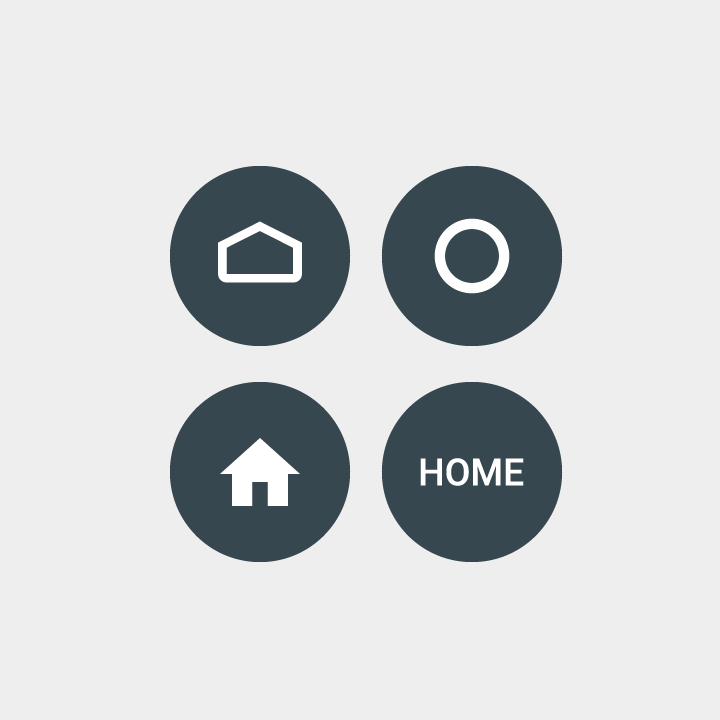
Home button

The home button takes the user to the system Home screen.
Back button

The back button gives viewers a way to return to the previous view.  

Microphone button

The microphone button invokes a search event.

Transport buttons

Transport buttons may include: play/pause, fast-forward, rewind, next, previous, stop, and record. They should control your current activity, if the action selected is supported.

Focus Expand and collapse content An arrow that points down when collapsed and points up when expanded.

Always have an object in focus. Text, buttons, cards, and some other elements can be focused.  Clearly indicate which control is in focus or selected.

Visibility

Indicate which element is in focus using appropriate visual cues. The default Android TV focus uses scale, shadow, brightness, and opacity to draw attention to itself against elements not in focus.

Do.

Use contrast to differentiate the item in focus from other items.

Don't.

Don’t make the focus difficult to recognize.

Feedback

Give user visual feedback on focus changes by displaying a transition between focused and non-focused states.

Android TV sounds provide audio feedback when focus is changed, and an action is selected.

Structure Expand and collapse content An arrow that points down when collapsed and points up when expanded.

Paths

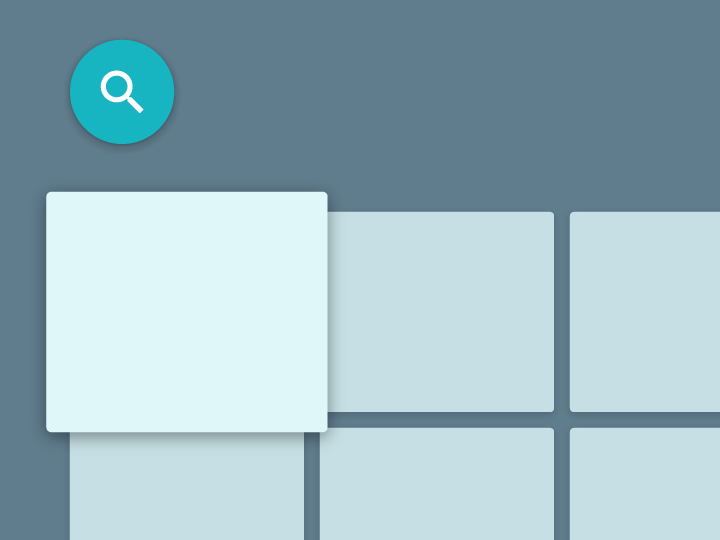
Users should be able to navigate your UI with clear direction. If there isn’t a straight path to get to a control, consider relocating it.  

Do.

Place controls, like the search action, in locations that don’t overlap with other clickable elements.

Don't.

Avoid layouts that contain controls in hard-to-reach places. Reaching the search action is not easy to manage with the D-pad.

Axes

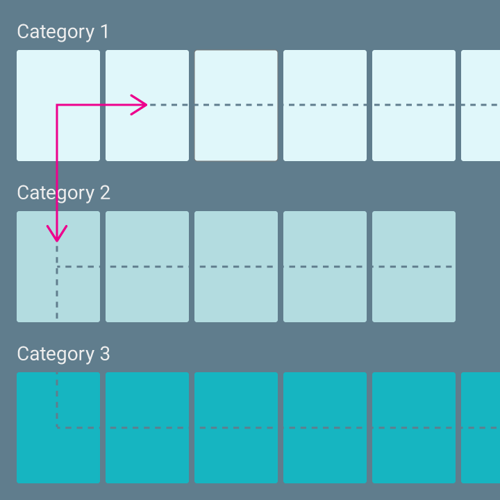
Design your layout so it takes advantage of both horizontal and vertical axes. Give each direction a specific function, making it fast to navigate large hierarchies.

Do.

Categories can be traversed on the vertical axis, and items within each category can be browsed on the horizontal axis.

Don't.

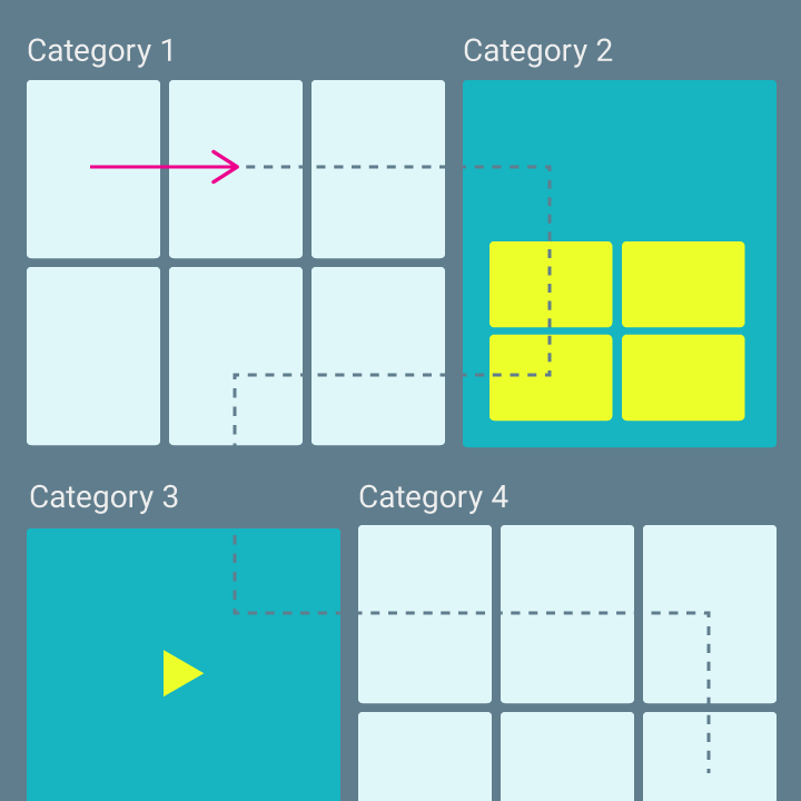
Avoid complex and nested layout hierarchy.