TV apps Consumption View

Consumption View

The Consumption View is where the user will engage with or watch content. Users will spend most of their time in this immersive experience.

Entry points Expand and collapse content An arrow that points down when collapsed and points up when expanded.

Android TV provides the shortest possible path to content through these three entry points:

  • Recommendation Row: Listing app recommendations on the Home screen
  • Global Search: Participating in global search enables user queries to reach your content
  • In-app: Easily accessible in-app content consumption
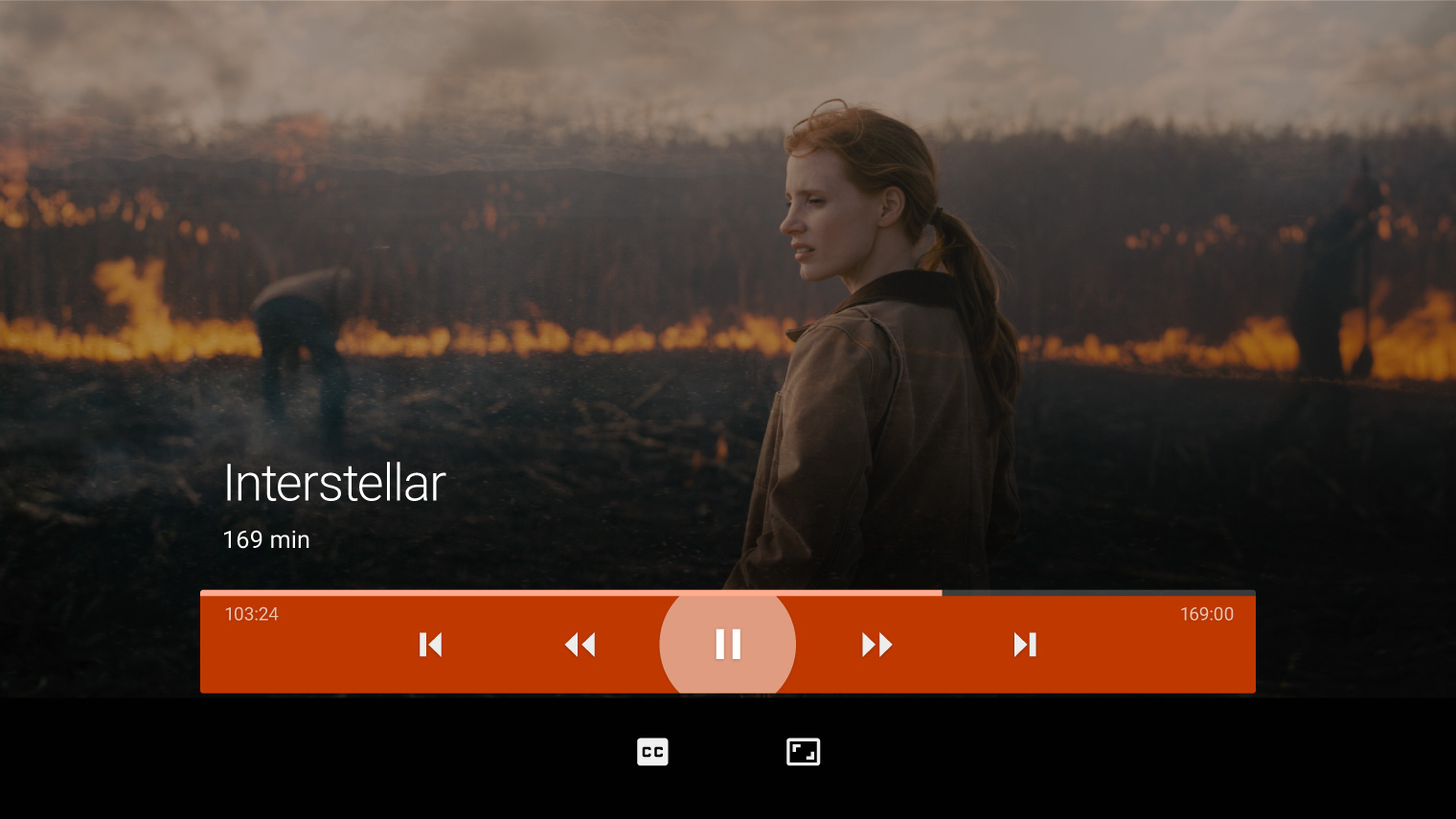
Transport Controls Expand and collapse content An arrow that points down when collapsed and points up when expanded.

Transport Controls give users control of the content currently playing.

Behavior

  • The controls are displayed by pressing any navigational button on an Android TV controller.
  • The center action is focused by default, so it should be the most commonly used action. In most cases, this action is Play/Pause.
  • Keep the number of available actions to a minimum.

Primary and secondary controls

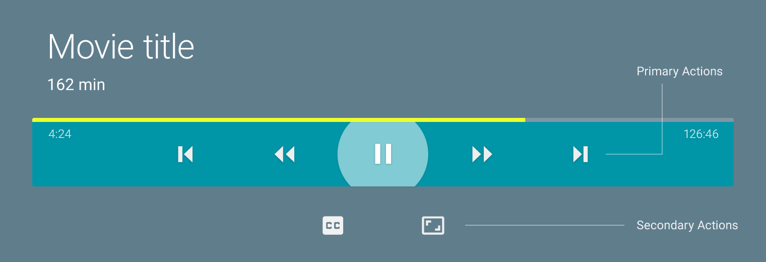
Transport Controls contain primary and secondary regions. These actions are represented by conventional, recognizable icons.

  • Primary actions appear on a Transport Control card. There are a maximum of seven actions.
  • Secondary actions display below the transport card, and contain non-essential functionality like closed captioning and aspect ratio. A maximum of five secondary actions is recommended.

Primary actions appear in the Transport Control card. Secondary actions display below.

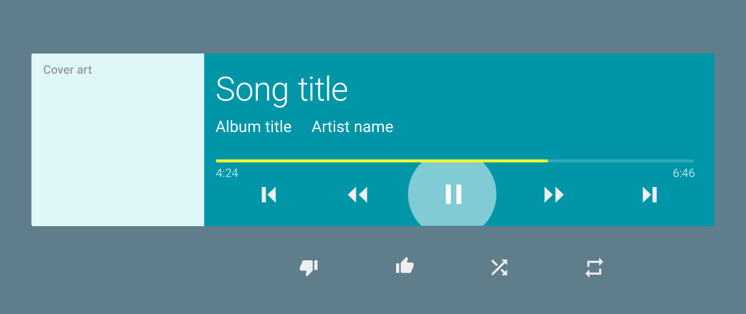
Transport Controls with artwork

Controls with artwork can only accommodate five primary actions.

For music, album art can be placed as shown in the diagram.

Extending the experience Expand and collapse content An arrow that points down when collapsed and points up when expanded.

There are two opportunities for extending the viewing experience:

  1. During a show
  2. At the end of a show

During the show

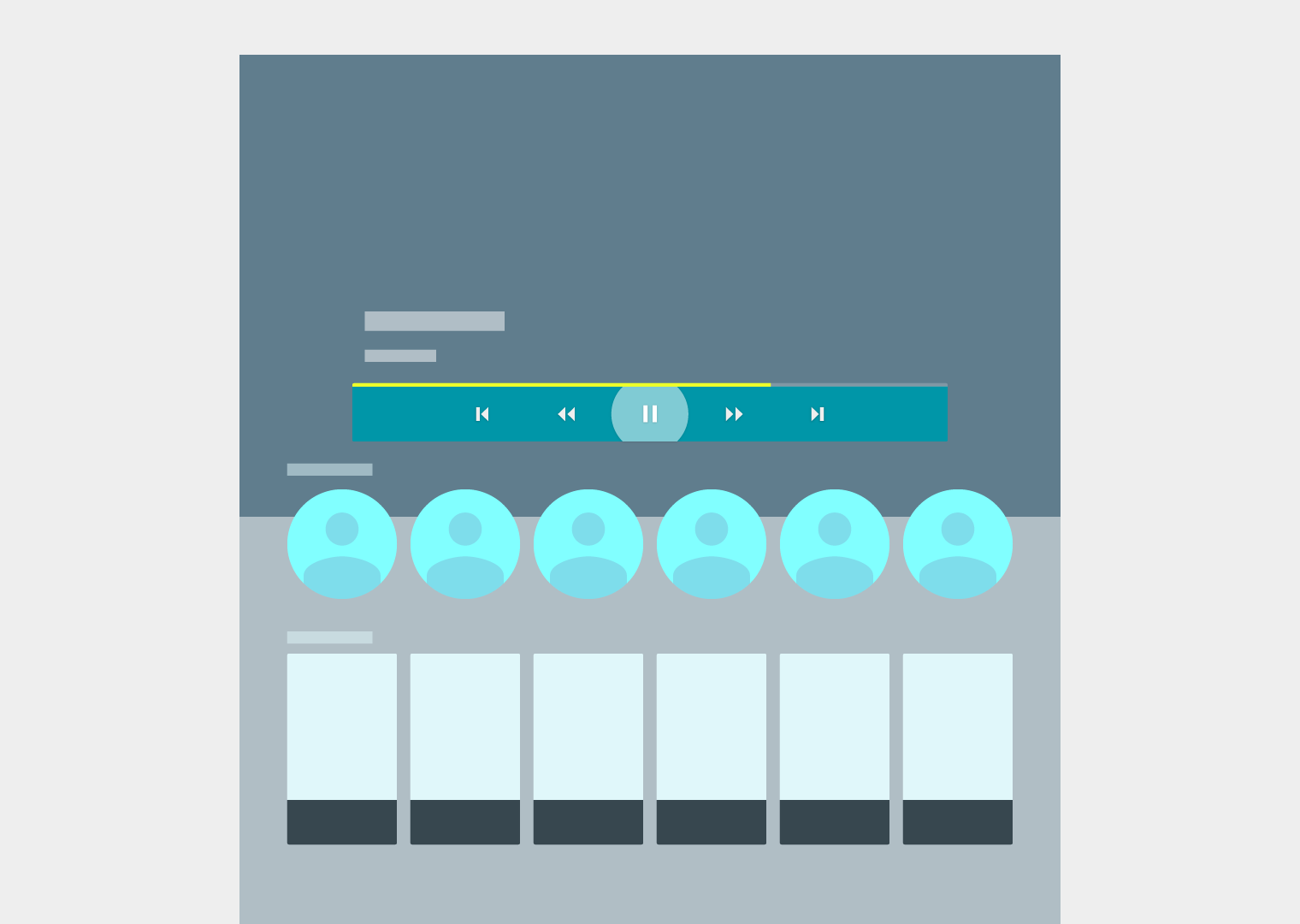
When the Transport Controls overlay is displayed during content viewing, viewing may be extended by showing relevant content to users such as the name of a song currently playing, the name of the actors in a movie being watched, the location of a scene, or product-placement information.

Actionable content and the most relevant information should be immediately visible without requiring the user to scroll. Related content should be visible upon scrolling.

At the end of a show

During the end of a show or movie, provide contextual actions to the user:

  • For episodic shows, provide a way to go to the next available episode.
  • For movies, provide quick access to similar movies or ask users to rate the movie just watched.

Present next content at the end of a movie/video.

Make resuming easy Expand and collapse content An arrow that points down when collapsed and points up when expanded.

Because there are many reasons users pause content, provide multiple avenues for users to quickly pick up from where they left off, such as:

  1. In-app option to resume content
    Resuming paused content is easier to find at the top level of the app.
  2. Through a Now Playing Card
    Participating in a Now Playing Card allows user to resume content from their most recent app from the Home screen.

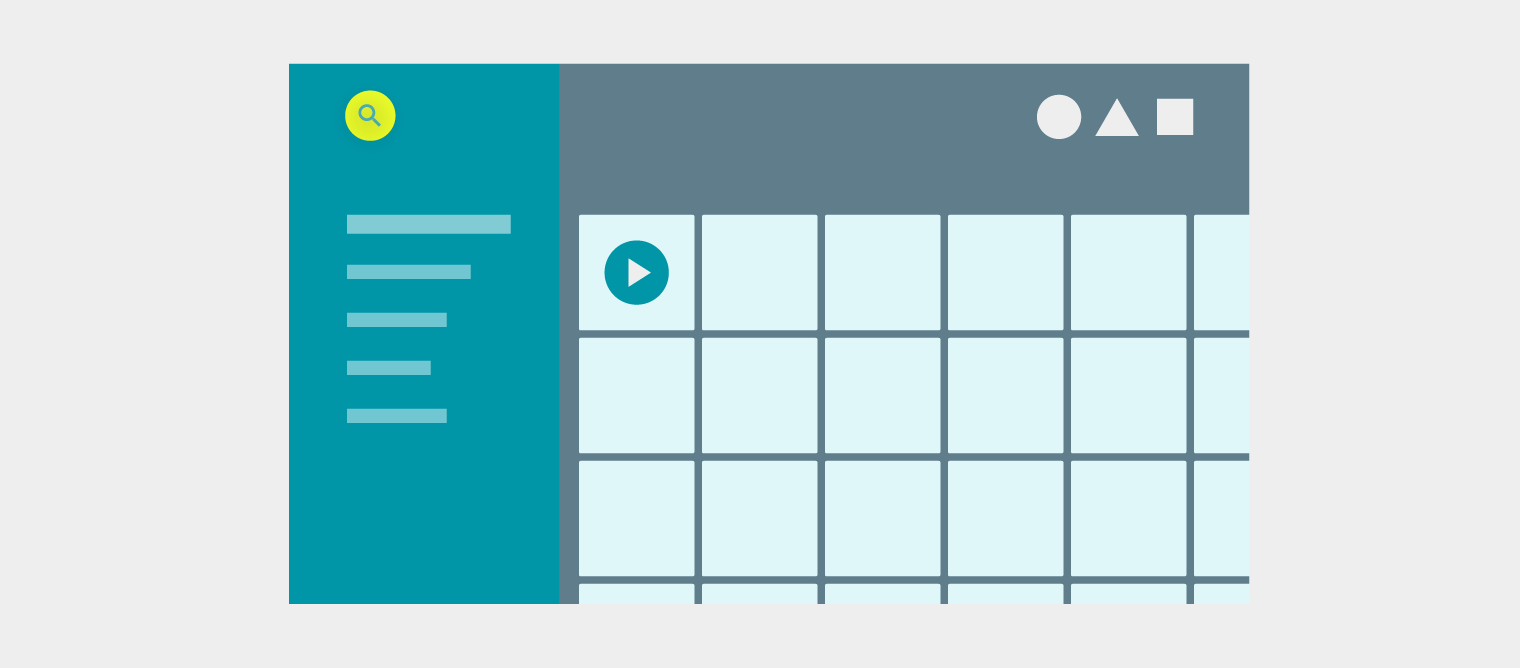
Use the first item in your application for the user to resume paused content.

Interstellar: © 2015 Paramount Studios. All Rights Reserved.